
A Few Words About Package Design

Personally, I like a little mix of both, pretty straight forward text with a touch of a pattern or some kind of intricate element that keeps you looking at the box. This brings me to my first pick of what I think is quality packaging. This line is for an Artisan Bakery in the UK designed by Here Design firm.
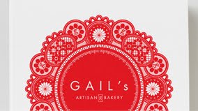
The shapes pop, they are recognizable without being to detailed, and the contrast of red on white is just to die for. Clean and simple with a touch of modern elements make this packaging design pretty yummy. See more pictures here.
With the good, comes the bad though. And it seems that when it is bad, it is really bad. There is a brand out there, that I (and many others) find so upsetting to the design world, that we spent an entire semester lamenting over it and going to therapy because of it (well, not really, but you know what I mean). The culprit is WalMart’s
ENTIRE line of “Great Value” packaging. Now I will give them credit for re-vamping the whole line, because I think they knew it was ugly, but it still looks awful.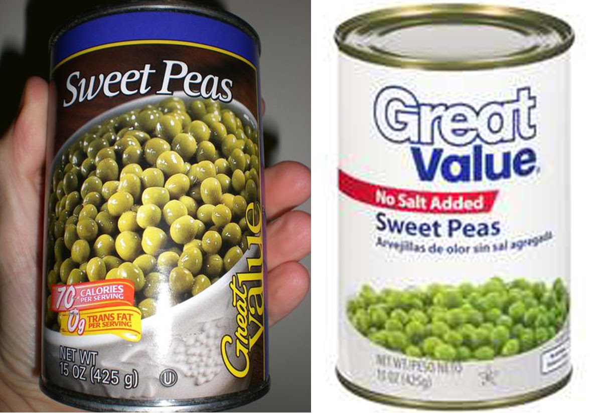
They went from an awful mix of golden script and serif font, to bold boring outlined san serif font. They changed the food pictures which is good, because no food on the old Great Value packages actually look appetizing. It might have been a great value, but that was only because it was rotten, and a month past it’s expiration date (according to the pictures). The package says nothing more than, “Huh, well this looks to be a box of moderately priced fruit snacks.”
Just because something may be a Great Value, doesn’t mean the integrity of the packaging should be compromised. Cheap foods want to be pretty too. People like to feel good about their purchases, and nothing about this branding makes anyone feel anything but depressed.
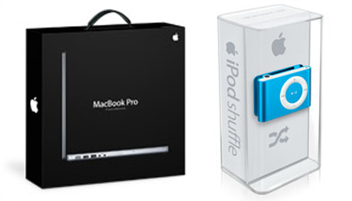
Because I am a lover of mac, I have to give a shout out to the designers of the Mac brand, and commend them on their beautiful packaging. Every case that a mac product comes in is perfect. They are elegant, and both texturally and visually pleasing. I think Mac has nailed it right on the head with their packages.
If you're interested in following new and upcoming design trends in the world of packaging, I suggest putting Dieline on your google reader: It's pretty much awesome.
 Categories: