
Android's inspiration?

Mark Ludwig has brought some very interesting news to our attention: Android has new branding, and it looks strangely familiar.
From The Verge's article:
"Posted earlier this week by Twitter account @upleaks, the alleged 17-second boot animation for LG's upcoming G Watch features the usual stylings of a Google-influenced Android device — but the interesting part comes at the end, when an all-new Android word mark appears. It's entirely in lowercase and has a softer, friendlier feel than the robotic futurism of the current logo — the only questions are whether it's real, and if so, whether it'll be canon for all Android branding going forward."
( Android is currently using the new logo on their main website, so I think we can assume that this is their new look.)
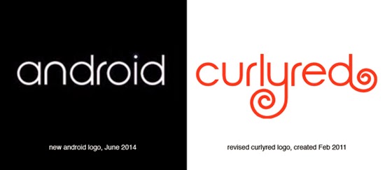
When we revised our CurlyRed logo in 2011, we took our favorite typeface, Century Gothic, and added the "curl" shape to both the "y" and "d" to reflect our name. But then we manually modified some of the character forms to feel more consistent and to flow visually. It appears that Android had the same desire. And the end result is beautiful and clean.
Android, we're watching you!
 Categories: