
Design trend: Handwritten Typography

 You're just my type.
It seems that more companies are looking to use fonts personal to the creators, and creating a revolution of Handwritten fonts. In a world that has gotten so mechanical, and technological, typography has followed suit. But it seems that more and more companies are reverting to handwritten type for their advertising, such as Starbucks new personalized Frappachino ad campaign. Why such the explosion of handwritten fonts? Maybe it is a way to get more in tune with the products and create personal interactions and connections with the consumer. People all over are using these handwritten unique fonts for all kinds of purposes.

Font Aid IV asked the help of over 400 artists to create a piece to raise money for Haiti. They asked the artists to create their own version of an ampersand (&). They put the 400 ampersands together in the emergency + symbol. You can buy your own copy of the project for $20 to help raise funds.

Companies like Starbucks have really boosted this new idea of personalized coffee with their use of handwritten fonts. Also their commercials for the new Starbucks Via, features coffee mugs with fonts that help depict the person drinking the coffee along with the “names” used to identify them (which aren't handwritten but have distinct personalities). Their ad campaign is a good example of the way handwritten fonts should be used.
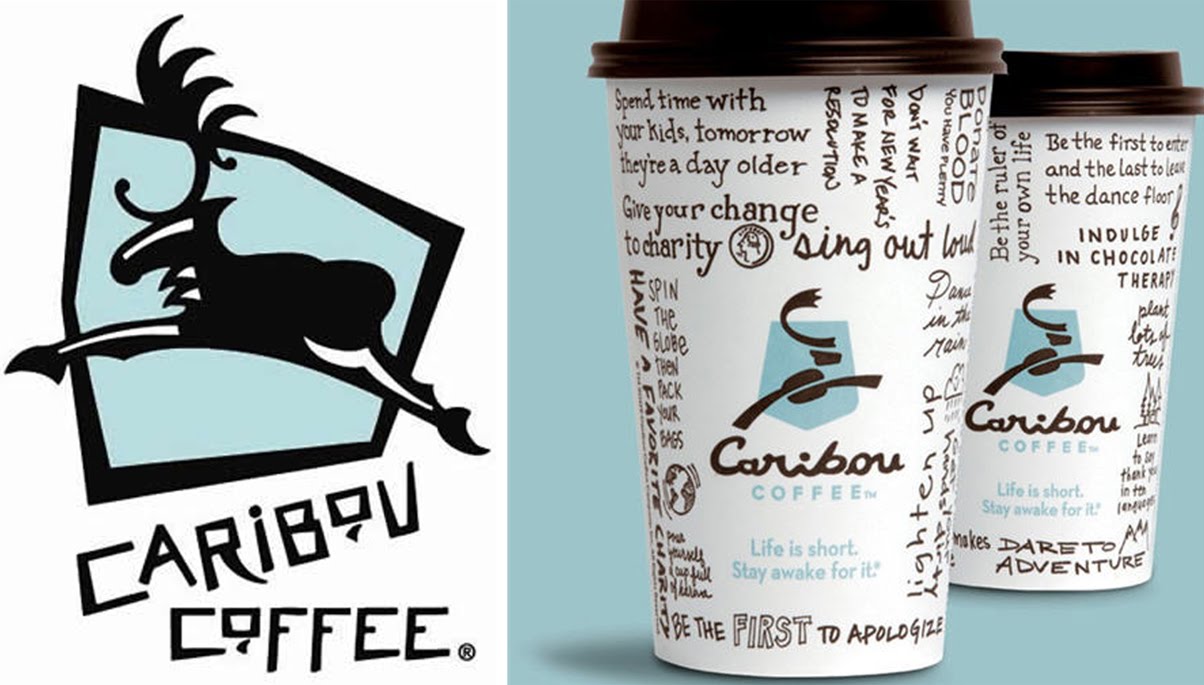
Also other good examples are companies like Carabou Coffee, in which they use the fonts to help get across a carefree, comical connection with the consumers.
On the other hand, some designers are emphasizing the handwritten fonts in the wrong way:

As much as I like the show True Blood, most of the posters for the seasons have an awful font layout. It looks like the designer didn’t space the text evenly, and squished the “Blood” in next to the “True”. Handwritten font isn’t supposed to be perfect but this font just looks sloppy. The vampires in the show are organized and extremely intelligent, the posters should reflect this someway, this font is just all wrong. For such an awesome show, the text on the poster should be a little more regal and a little less like a 5 year old drew it with a crayon.
I think this handwritten font thing is an ever growing fad, pretty soon to be overdone, but worth looking into or trying for yourself. And to the ever-dreaded Comic Sans:

 Categories: Caribou, Font Aid, handwritten Typography, Starbucks type, summer 2010 design trends, True Blood font