Election 2008 Design Trends


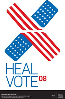
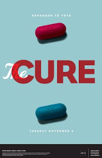
With less than a month to go, election design is all around us.
Recently, AIGA had a contest called "Get Out the Vote 2008" where designers submitted designs for posters encouraging Americans to vote. Above are some of my favorite winning posters.
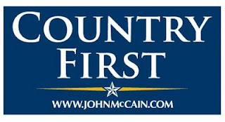
As far as the candidates go, the McCain/Palin ticket seem to be relying heavily on text only. In fact, I had a hard time finding any McCain posters or signage with imagery. But they are consistent in color scheme and in using this campaign's typeface of choice, Optima:
And then there are the Obama/Biden posters, which rely much more on strong, simply colored images and minimal text:
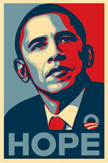
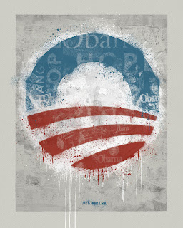
Visually, the Obama/Biden posters are more visually appealing to me, but I also think the Optima typeface is strong and works to convey McCain's reputation as sturdy, patriotic and dependable. Regardless, both campaigns have fully embraced the importance of strong branding.
What do you think?


 Categories: